App Redesign
Water Savvy is an app that shows water quality based on a user’s geolocation. It provides evaluations for different activities such as drinking, swimming, and recreation, helping users make informed decisions about their environment.The goal of this redesign was to improve user experience by making critical information more accessible, navigation more intuitive, and results easier to interpret.
SEE LIVE WEBSITE
Client
Water Savvy
Service
UI/UX Design
Year
2025
Challenges
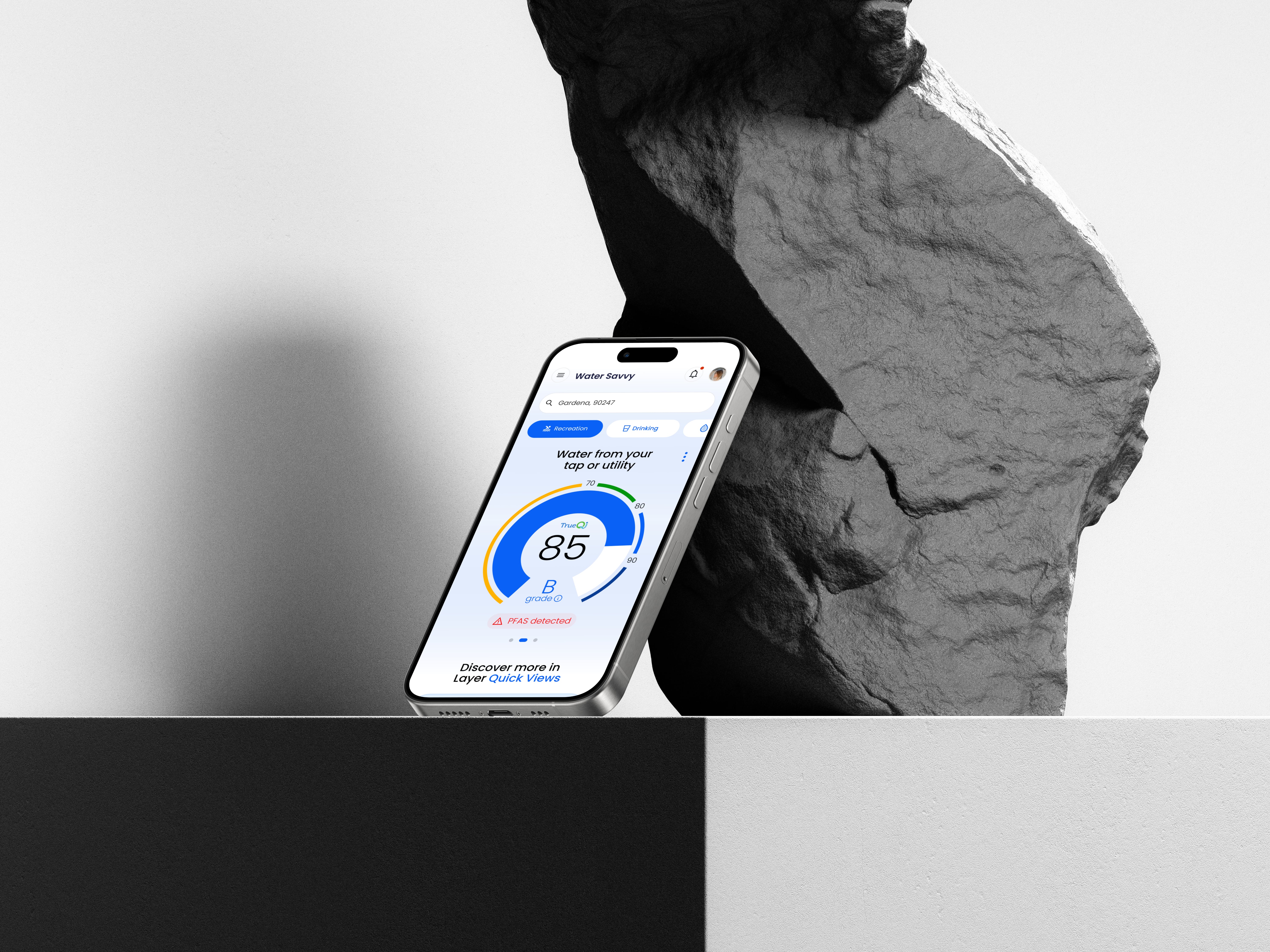
- Geolocation was not prominently displayed, making it harder for users to know where the data applied.
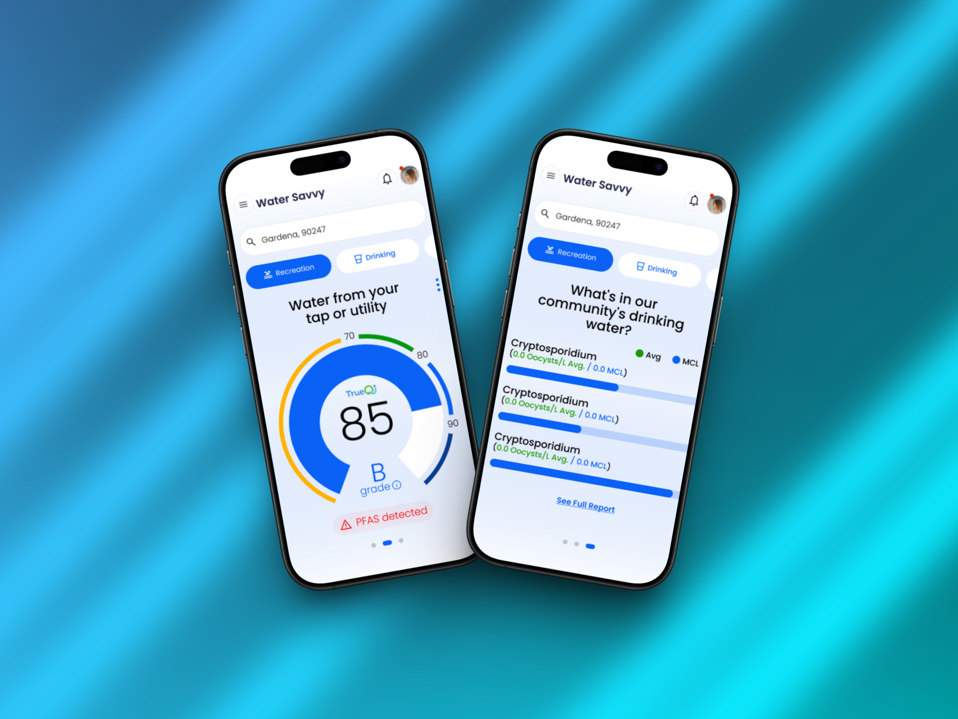
- Switching between different types of water evaluations required multiple taps.
- The scale for water quality lacked clarity, and harmful chemicals were not clearly indicated.
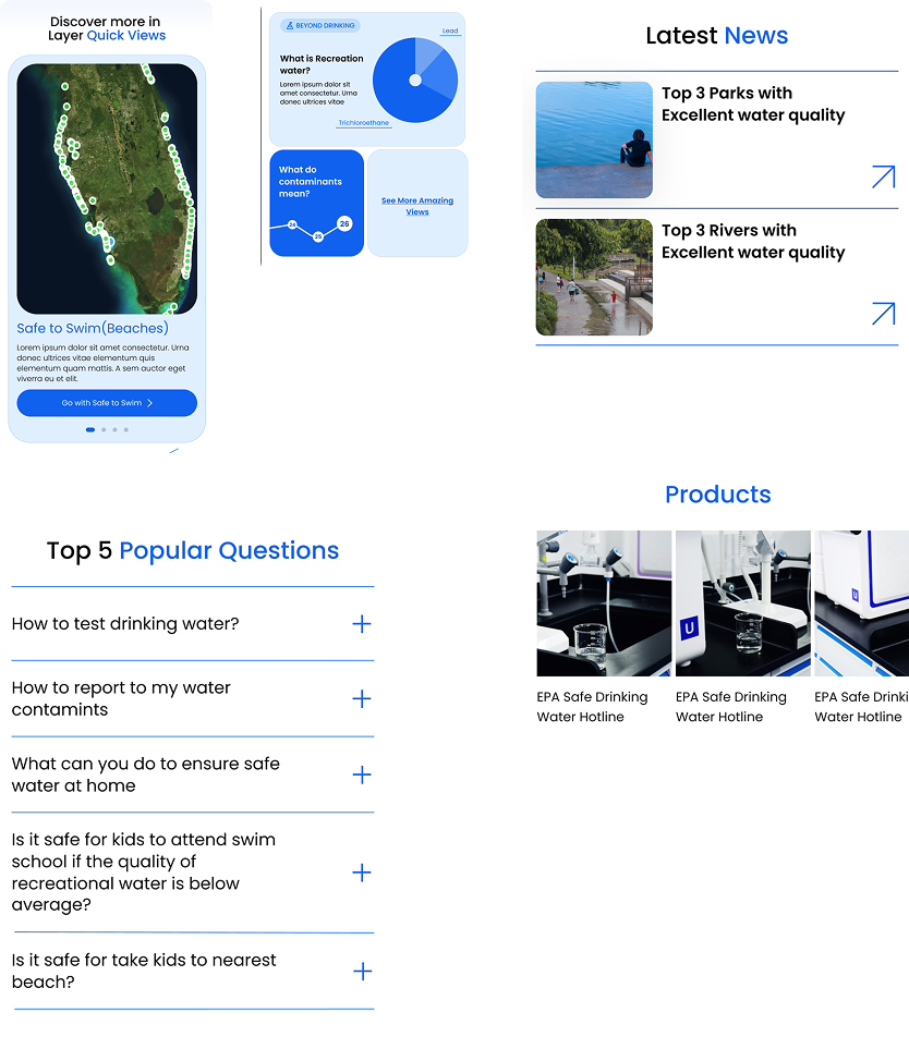
- The “Quick Views” feature was underutilized due to poor visibility and unclear benefits.
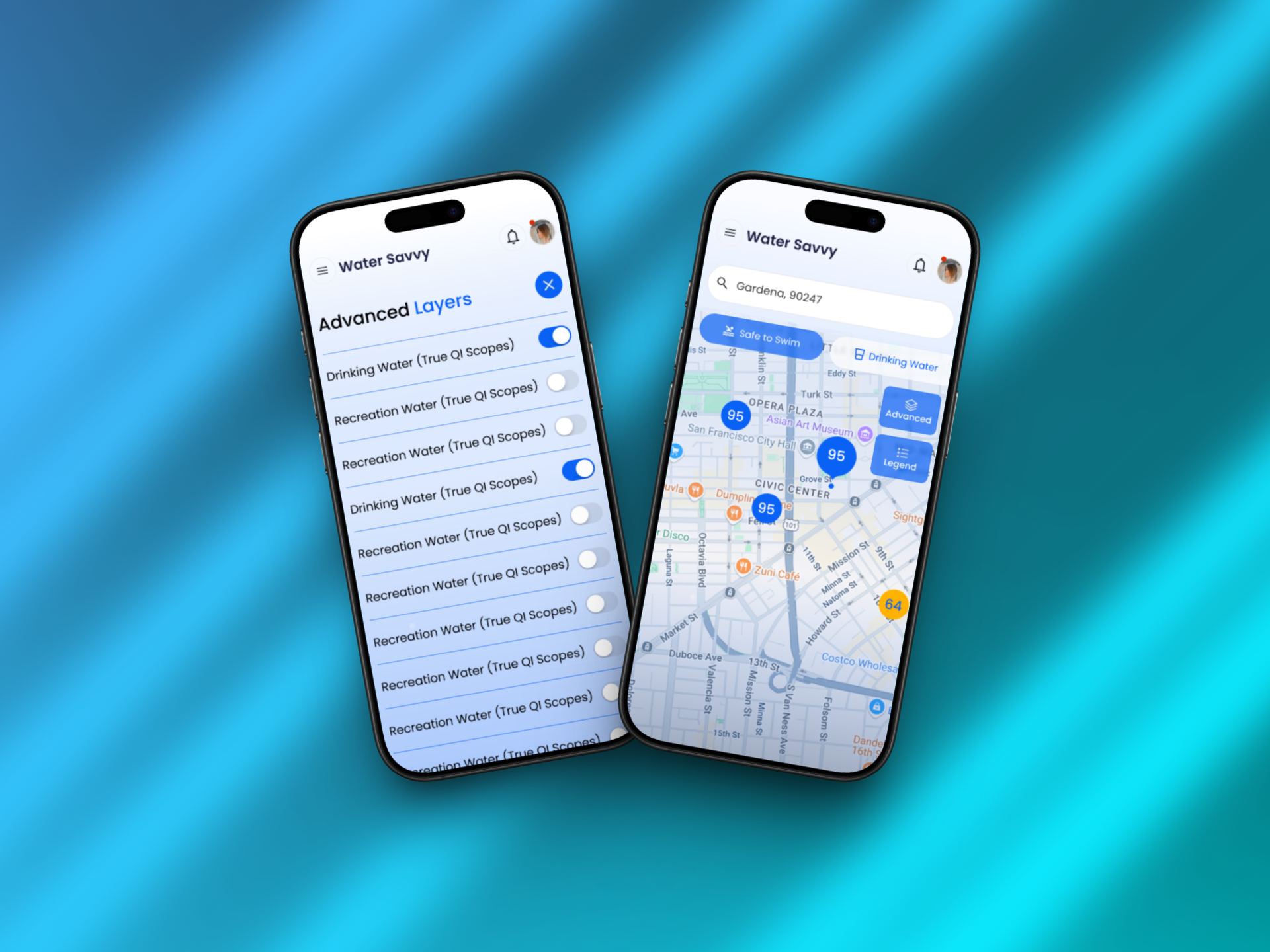
- Detailed map views made it difficult to quickly assess water quality at a glance.
Design Goals
- Highlight and simplify access to geolocation – the starting point for all evaluations.
- Streamline navigation between water evaluation types.
- Clarify the water quality scale and highlight dangerous chemicals when detected.
- Introduce and explain Quick Views to encourage usage.
- Improve detailed map views for faster and easier understanding.
Solutions
1. Geolocation Front and Center
- Moved geolocation to the top of the screen, making it instantly visible and confirming to users that results are based on their current location.
2. Easy Navigation Between Evaluation Types
- Implemented tabs with intuitive icons (e.g., a glass for drinking, a swimmer for swimming) to allow users to switch instantly between activity-based evaluations.
3. Clearer Scale and Hazard Alerts
- Redesigned the water quality scale with color coding and highlighted harmful chemicals so risks are immediately visible.
4. Quick Views with Context
- Introduced a slider system featuring images and short explanations for each preset, helping users choose the right settings based on their needs.
5. Improved Detailed Map View
- Applied a color-coded scheme for zoomed-in maps, enabling users to quickly spot safe and unsafe areas without deep reading.