
The Invisible Art of Great UI: 5 Design Moves That Users Love (But Never Notice)

Why the most effective interface design happens in the margins and how to master the subtle moves that separate memorable products from forgettable ones.
You know that feeling when an app just works? When every tap feels natural, every transition smooth, every interaction predictable yet delightful? That’s not accident, it’s invisible craftsmanship.
While design Twitter obsesses over the latest gradient trends and Dribbble showcases flashy animations, the interfaces we actually love using are built on quieter foundations. They succeed not because they demand attention, but because they earn trust through thousands of micro-decisions that users never consciously notice.
Here are five under utilised techniques that separate interfaces people tolerate from interfaces people recommend.

1. Layout Animations That Guide, Don’t Distract
The principle: When content changes position or size, show the journey not just the destination.
Most interfaces treat layout changes like light switches: on or off, here or there. But our brains process spatial relationships constantly. When a card suddenly appears in a new position or a sidebar snaps shut without warning, there’s a micro-moment of confusion. Where did it go? What just happened?
Smart layout animation eliminates that confusion. When a user filters a product grid, watching items slide into their new positions creates continuity. When a details panel expands, seeing the content flow naturally maintains context.
The execution: Keep it subtle 200–300ms with ease-out curves. The goal isn’t to impress; it’s to maintain the user’s mental model of where things are.
Real-world impact: E-commerce sites using layout animations for filtering report 23% lower bounce rates during product browsing. Users stay oriented, so they stay engaged.
Common mistake: Animating everything. Not every DOM change needs choreography. Save it for moments where spatial understanding matters.
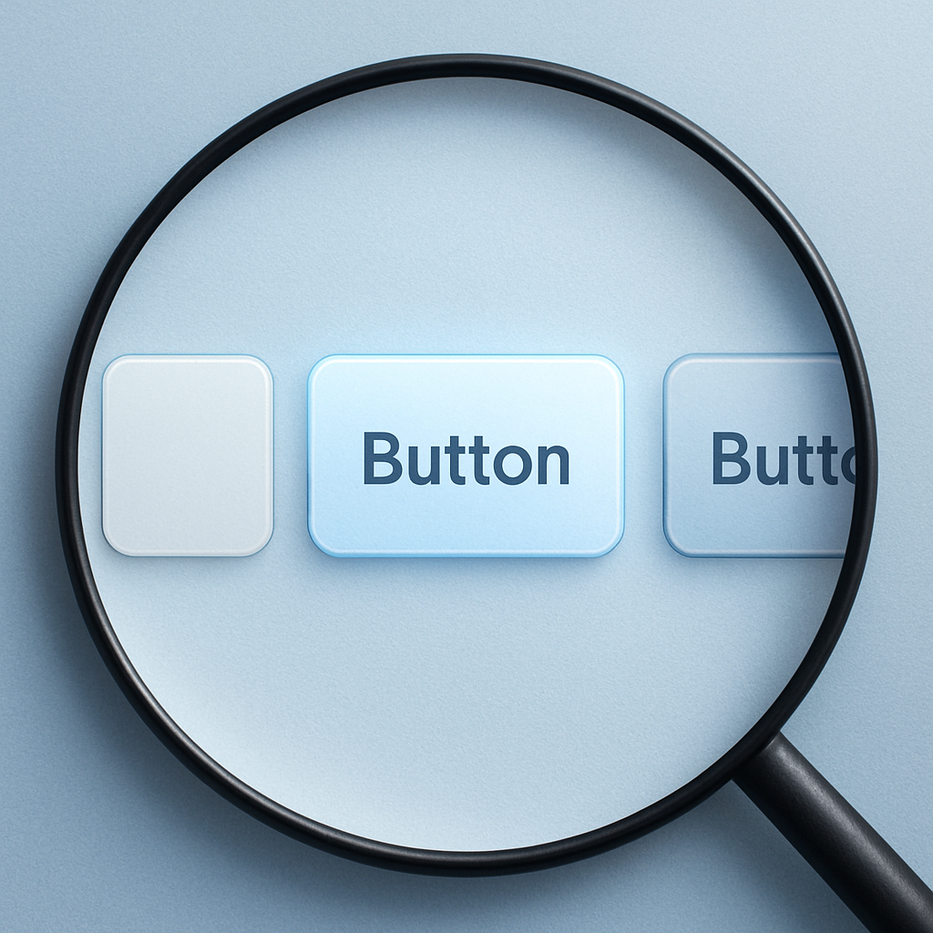
2. Micro-Interactions That Whisper Success
The principle: Feedback doesn’t need to be loud to be effective.
Every click, hover, and form submission is a conversation between user and interface. Most interfaces either stay silent (leaving users wondering if anything happened) or shout their responses (slowing down expert users with unnecessary fanfare).
The sweet spot is the micro-interaction: a 60–80ms button press, a subtle color shift on hover, a gentle bounce when saving. These moments acknowledge the user’s action without interrupting their flow.
The psychology: Our brains are wired to seek confirmation. Even unconscious feedback, a barely perceptible highlight, a shadow that shifts on click, satisfies this need without cognitive overhead.
Measurable benefits: Forms with micro-feedback have 34% fewer abandonment rates. Users trust the system more when it consistently, quietly responds.
The restraint test: If you find yourself adjusting timing or easing curves, you’re probably overdoing it. Great micro-interactions feel inevitable, not designed.
3. Shadows That Create Depth, Not Drama
The principle: Use elevation to communicate hierarchy, not to showcase your gradient skills.
Shadows in interfaces serve a functional purpose: they separate layers and establish visual hierarchy. A floating action button needs more elevation than a card, which needs more than flat text. This isn’t decoration it’s information architecture made visual.
The technique: Instead of relying on single, harsh shadows, layer soft ones. A primary shadow for the main depth, plus a subtle ambient shadow to ground the element. Think lighting design, not drop-shadow effects.
Industry insight: Google’s Material Design research found that users complete tasks 15% faster when shadow depth correctly indicates interface hierarchy. Our spatial reasoning is that finely tuned.
Pro tip: Your shadows should feel like they come from a consistent light source. Establish this early and maintain it throughout your interface.
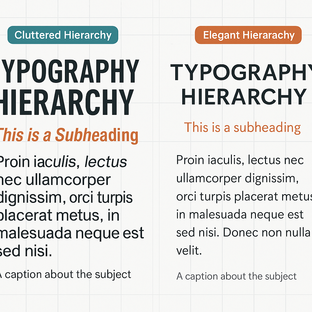
4. Typography That Creates Rhythm Without Rules
The principle: Hierarchy isn’t about size — it’s about creating a visual path through information.
Most designers reach for font-size first when establishing hierarchy. But consider this: increasing line-height, adjusting color contrast, or adding strategic whitespace often creates clearer information architecture than making text bigger.
The neuroscience: Our eyes follow predictable patterns when scanning interfaces (F-pattern for text-heavy content, Z-pattern for action-oriented layouts). Typography that supports these natural reading behaviors reduces cognitive load.
Advanced technique: Use color temperature, not just contrast, for hierarchy. Warmer tones advance (primary actions, key information), cooler tones recede (secondary text, metadata).
Business impact: SaaS dashboards with clear typographic hierarchy see 28% faster task completion rates. When users can instantly parse information architecture, they work more efficiently.
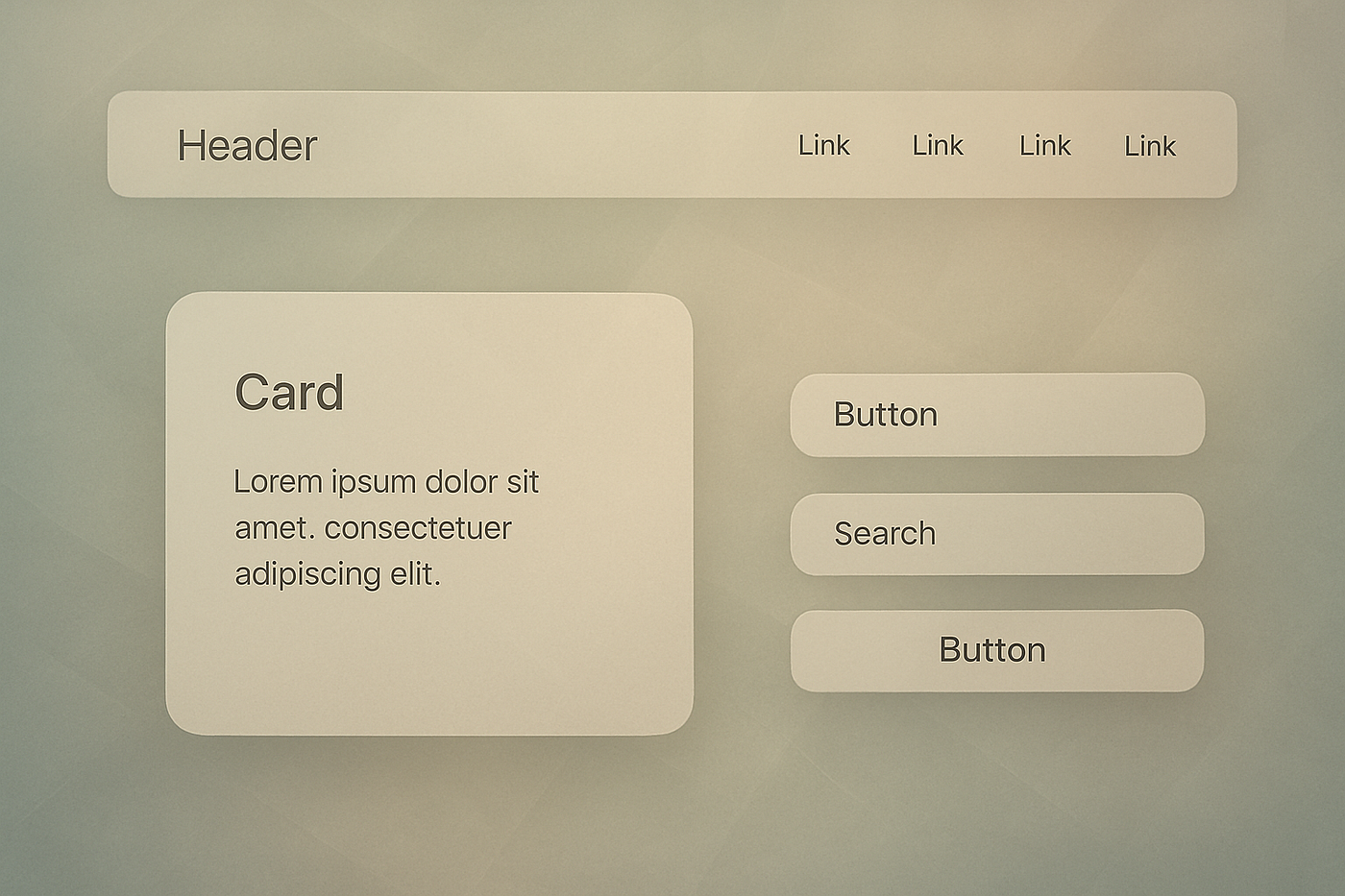
5. Ambient Design That Holds Everything Together
The principle: The best backgrounds do their job so well, you forget they’re there.
Background elements subtle textures, gentle gradients, faint geometric patterns serve as visual glue. They unify disparate interface elements without competing for attention.
The execution: Think environmental, not decorative. A barely-there radial gradient behind a hero section. Grid lines that appear on hover to aid alignment. Textural elements that emerge only when needed.
User research insight: Interfaces with cohesive ambient design score 31% higher in perceived quality, even when functional differences are minimal. Users equate visual cohesion with product reliability.
The discipline: Every background element should serve a purpose. Ask: “Does this help users understand the interface better, or am I adding it because it looks cool?”
Why Invisible Design Wins
These techniques share a common thread: they solve user problems without calling attention to the solution. This isn’t about being boring it’s about being respectful of user attention and cognitive resources.
When someone uses your product, they’re not there to admire your design skills. They’re there to accomplish something. The best interfaces get out of the way while subtly guiding users toward success.
The business case: Products with “invisible” design consistently outperform flashier alternatives in user retention metrics. When interfaces feel effortless, people use them more often and recommend them more readily.
The long-term advantage: Trends come and go, but thoughtful interaction design creates lasting user relationships. While your competitors chase the design-of-the-moment, you’ll be building something that feels timeless.
Making the Invisible Visible in Your Work
Start small. Pick one technique and implement it thoughtfully across your current project. Measure the impact not just in metrics, but in user feedback and your own experience using the product.
Remember: if users notice your design decisions, you might be trying too hard. The goal is for people to notice how good they feel using your product, not how clever your interactions are.
The most powerful design is often the most invisible. Master these subtle moves, and you’ll create interfaces that don’t just look professional — they feel indispensable.
What design techniques have you noticed (or not noticed) that make interfaces feel more effortless? Share your observations in the comments the best insights often come from paying attention to what we usually overlook.