
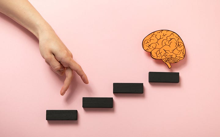
5 design psychology secrets every UI/UX designer should know
Good design isn’t just about picking the right colors or using a grid so neat it would make your math teacher proud. The real magic? Psychology.
When you understand how people actually think, click, and occasionally rage-quit, you can design interfaces that feel natural, like the product is reading their mind. (But not in a creepy “your phone is listening” way.)
I apply these principles in real projects on Meraki Designs, turning psychology into practical design decisions. Because knowing these concepts is one thing, using them effectively is another.
Let’s dive into five psychology secrets that every UI/UX designer should know if they want to make designs that not only look good but actually work.
1. Cognitive load: Don’t make users think harder than they need to
The human brain is powerful, sure. But it’s also lazy. Users don’t want to solve puzzles every time they open your app. If your design feels like an IQ test, they’ll leave faster than you can say “forgot password.”
Your job as a designer isn’t to prove how clever you are, it’s to make users feel clever. Reduce the mental effort needed to use your product, and suddenly everything feels smoother.
Tips to reduce cognitive load:
- One main action per screen is usually enough.
- Don’t overload users with 12 menu options when 4 will do.
- Hide complexity until it’s needed (advanced settings can stay advanced).
Think of it as cleaning your room before guests come over. Sure, you know where the piles are, but they don’t need to see that chaos.
2. Hick’s Law: Too many choices = decision paralysis

Hick’s Law says the more options you give, the longer people take to choose, and the more likely they are to slam their laptop shut and order pizza instead.
Ever stared at a dropdown with 300 options, desperately looking for the one you want? That’s Hick’s Law in action.
Good design reduces decisions, not freedom. Show the most relevant options, highlight defaults, and break big tasks into small steps.
Quick wins:
- Use progressive disclosure (show options gradually).
- Highlight the most common or recommended choices.
- Pre-fill defaults (most users won’t change them anyway).
Because no one should need a search party to find “Undo Action” in a dropdown.
3. Fitts’ Law: Make targets easy to hit
Tiny buttons. Microscopic close icons. Links so thin they belong in a hair commercial. Nothing makes users angrier.
Fitts’ Law tells us the time it takes to click something depends on its size and distance. Translation? Bigger buttons, closer to where users actually interact = better experience.
How to apply it without rage-clicks:
- Touch targets on mobile should be at least 44px (unless you enjoy lawsuits from people with normal-sized thumbs).
- Put primary actions in easy-to-reach “thumb zones.”
- Don’t put destructive actions (“Delete account”) right next to safe ones (“Save changes”).
Remember: users aren’t ninjas with laser pointer fingers. Design for normal human hands.
4. The Peak-End Rule: Users remember the best and the last moments
Here’s the truth: people don’t remember the entire journey. They remember the most intense moment and the ending. That’s it.
So if your onboarding is great but your success screen looks like a 404 page from 2008, that’s what users will take away.
Design like this matters:
- Make peak moments delightful (the “aha” when something works).
- Never neglect endings: confirmation messages, thank-you pages, and success animations matter more than you think.
- Add small emotional touches: confetti, humor, or satisfying animations go a long way.
Think of it like dating: you’ll be remembered for the highlight of the night and how you said goodbye, not the middle part where you talked about your Wi-Fi speed.
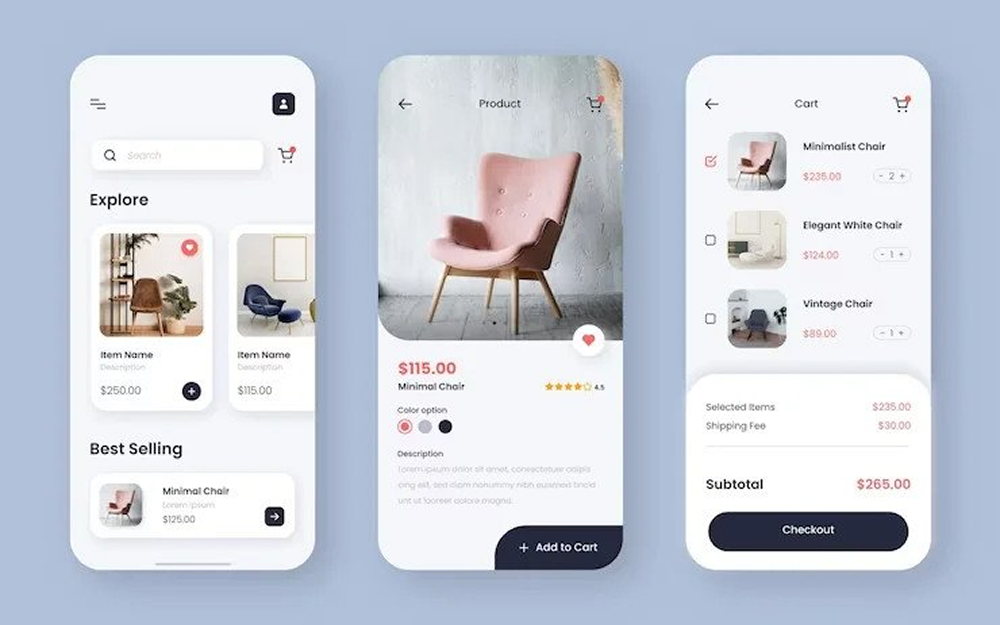
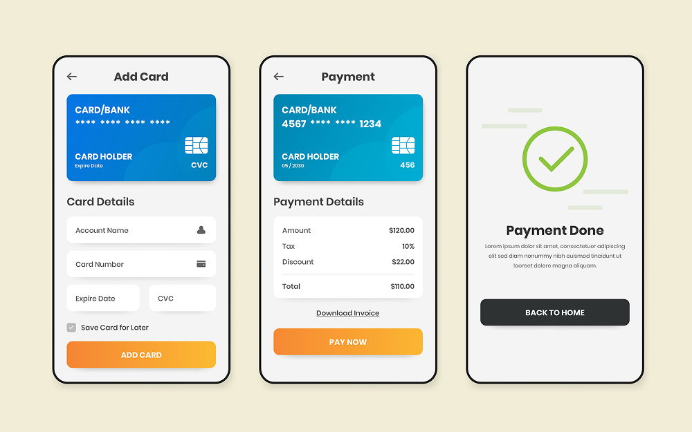
5. Familiarity > originality (at least in UX)

We get it. You want to reinvent the wheel. But users don’t want a triangular wheel, no matter how “innovative” it looks.
Familiar patterns feel safe. Login forms, navigation bars, checkout flows, they all follow conventions for a reason. Break them, and your users will break up with you.
Stick to what works:
- Keep common flows standard (sign-up, login, navigation).
- Save your creativity for visuals, animations, and microinteractions.
- Remember: weird = suspicious, familiar = trustworthy.
There’s a reason nobody messes with the order of “email” then “password.” Keep the basics boring, and make the extras delightful.
Wrapping it up
Great design isn’t just art, it’s psychology. By reducing cognitive load, limiting choices, making interactions easy, focusing on memorable moments, and leaning on familiar patterns, you design experiences people actually want to use.
Because at the end of the day, good design isn’t about making something look clever. It’s about making people feel clever, and that’s what gets them coming back
If you’d like to see how I put these principles into practice, check out my work at Meraki Designs.
Source: Medium