
10 UX secrets from Apple that will make your product irresistible
If Apple were a person, they’d be that effortlessly cool friend who always shows up in the perfect outfit, never trips over their words, and somehow makes drinking water look elegant. Behind all that charm is ruthless attention to detail, a borderline unhealthy obsession with user experience, and a design philosophy that’s shaped half the internet.
You can steal a few pages from the Apple UX playbook, and make your product better, cleaner, and just a little more addictive.
1. Sweat the micro-stuff
Apple sweats the stuff you’ll never notice, until it’s gone. Like the way icons bounce slightly when you drag them on iOS. Or how the volume slider feels oddly physical. These aren’t random flourishes. They’re deliberate.
In UX, small things aren’t small. They’re how you show users you give a damn.
You don’t have to design everything from scratch. Tools like MadeinFigmagive you polished UI kits and flows, so you can obsess over the micro-interactions instead of reinventing buttons.

2. Kill features like a villain

Simplicity doesn’t mean “lacking features.” It means you murdered 17 things so this ‘one thing’ could shine.
Apple does this constantly. If a feature confuses or slows down users, it’s gone. This is why the iPhone doesn’t have a task manager built into the dialer app. (Yes, someone out there tried that.)
Your product doesn’t need to be everything to everyone. It just needs to be amazing for someone.
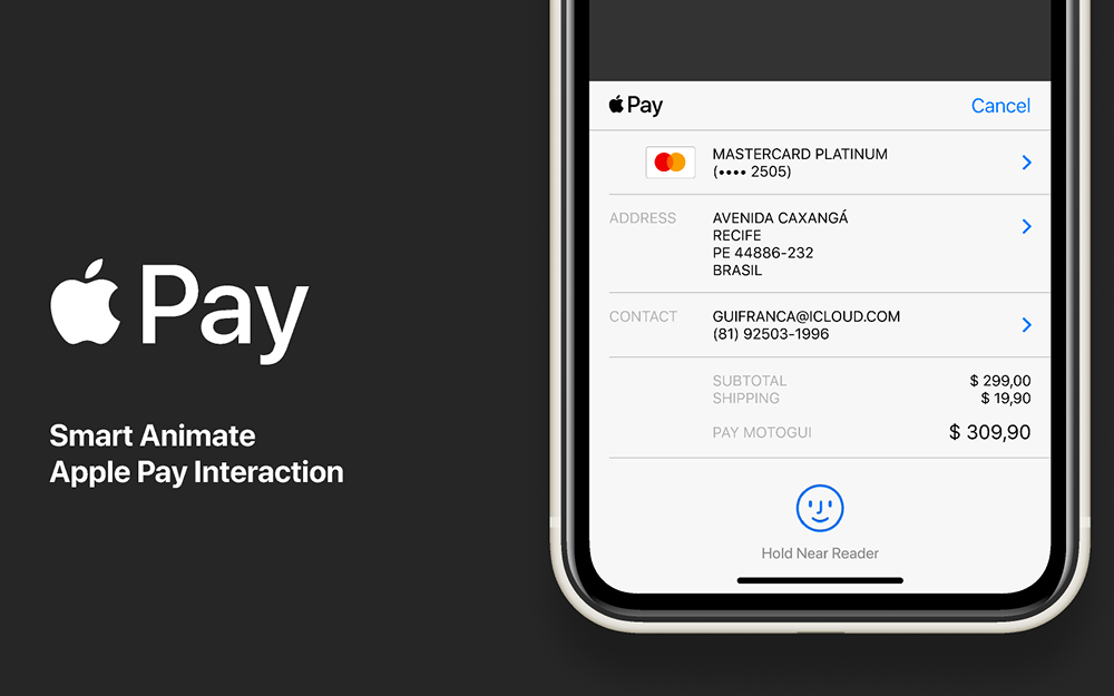
3. Animate with purpose, not just vibes
Animations are the transitions of UX. And like transitions in a PowerPoint, they can either be tasteful or full Vegas.
Apple uses animation to teach and guide. When a window shrinks into the dock, your brain maps where it went. It’s UX kung-fu: invisible, effective, and satisfying.
4. Make the interface disappear

The best interface is the one people forget they’re using. Sounds boring? Maybe. But invisibility is the dream.
Ever notice how the Notes app on iOS has basically no interface? That’s not lazy. That’s confidence.
Your job as a designer is to make the user feel like a genius, not to remind them how hard you worked on that button shadow.
5. Stay consistent, then throw in a surprise
Everything Apple does follows a pattern, until it doesn’t. That’s how they earn delight.
Think of it like jazz: you stick to the rhythm so that when you break it, it’s beautiful, not confusing.
Use consistent layout, spacing, and behavior across your product. Then reward users with a tiny surprise. A fun empty state. A satisfying click. A corgi animation. (Okay, maybe not a corgi.)
6. Solve problems, not trends
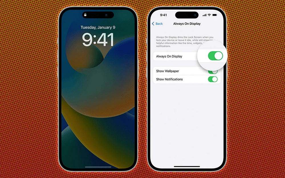
Apple doesn’t jump on trends for the sake of it. They didn’t have an ‘Always-On’ display until they could make it useful and battery-efficient.
Good UX is practical. It removes pain. So instead of asking “What’s hot right now?”, ask “What’s annoying my user today?”
7. Talk to users like they’re people, not error logs
If your interface says, “Unexpected input string at line 3,” please take a walk.
Apple writes with clarity, humanity, and occasionally, charm. When you connect you Airdrops, it says, “Waiting…” not “Transmitting packet 4 of 278.”
Words are part of UX. Good copy can turn a bug into a shrug.
8. Design for feelings, not just functions
Apple understands that UX isn’t just about usability. It’s about emotion.
Think of the iPhone alarm telling you how many hours of sleep you’ll get. That’s empathy in UI form.
Your product should do more than work. It should reassure, encourage, and celebrate. That’s what creates loyalty.
9. Own your mistakes
Apple gets flak, but they also own their screw-ups. When they shipped buggy keyboards, they offered free repairs. They didn’t slap a sticker on your screen and say, “Try not to type too much.”
When your app fails, be honest. Offer a path forward. Design an error state that feels like a human, not a firewall.
10. Test with humans (not the team Slack)
Designers are not users. Developers are definitely not users. You are especially not the user.
Real feedback comes from people who don’t care about your Figma file names. Watch them use your product. Watch them get stuck. Cry a little. Then fix it.
The faster you can get a usable prototype in front of people, the better. If needed, use MadeinFigma to quickly design a prototype with full flows that actually look good.
Closing thoughts:
Apple’s UX magic isn’t magic. It’s a process. It’s empathy. And it’s a refusal to settle for “good enough.”
You don’t need a spaceship campus to do the same. Just a bit of taste, a lot of care, and maybe a head start from the right design tools.
Start small. Think big. Obsess over the details. Then ship it before you overthink it for a year.
Source: Medium