
10 UX mistakes that kill early-stage startups
Startups don’t usually die because of lack of funding, competition, or a brutal takedown on Twitter. They die because customers open their app or website, poke around, and think, “Nah, this is annoying.” Then they close the tab forever and never come back.
The silent killer of early-stage startups? Bad UX.
I’ve been designing products for over 15 years, and I’ve seen this happen more times than I can count. That’s part of why I started building resources like MadeinFigma.com, to help founders and designers avoid these mistakes by giving them ready-to-use systems and flows that actually work.
When you’re an early-stage founder, it’s easy to obsess over features, growth hacks, and whether your pitch deck has enough stock photos of people pointing at whiteboards. But the truth is, if users hate the experience, none of that matters.
Here are 10 UX mistakes that quietly strangle startups in their crib, so you can avoid them, or at least laugh darkly as you realize you’ve made three of them already.
1. Confusing onboarding
Onboarding is like a first date. If it’s awkward, confusing, and takes 20 minutes of filling out forms, there’s no second date.
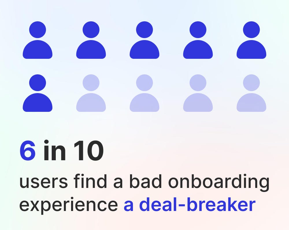
Example: Remember the apps that make you “create your workspace,” “invite your team,” “set your profile picture”, and then “tell them your life story” before you can even see the dashboard? Congratulations, you just lost 80% of your signups.
Fix it: Keep onboarding stupidly simple. Let users experience value fast. Get them to the “aha” moment before you bombard them with profile setups and optional extras.
2. Feature overload
Founders love features. Investors love features. Users? Not so much.
A common mistake is shoving every idea into the MVP like you’re at an all-you-can-eat buffet. The result: a bloated, confusing mess where no one knows what to click.

Example: Early productivity apps that try to be calendar + to-do list + CRM + email client + digital pet rock. Users end up asking, “Cool… but what is this app actually for?”
Fix it: Pick the one problem you’re solving. Solve it cleanly. Add other features later, after users actually love the core experience.
3. Tiny buttons and click targets
Nothing makes users rage-quit faster than trying to tap a 20px button on mobile. Unless you’re building an app for surgeons with steady hands, nobody should need precision tools to close a modal.
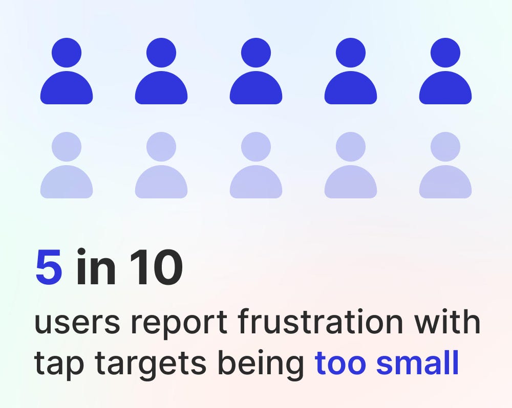
Example: That one “X” in the corner of a popup that’s smaller than a dust particle. Users miss, hit an ad, and suddenly they’re shopping for insurance instead of exploring your product.
Fix it: Follow Fitts’ Law like it’s religion. Make targets big enough. Put them where thumbs can actually reach. Don’t punish normal-sized hands.
4. Bad error messages
“Something went wrong.”
Great. Thanks. That’s as helpful as a mechanic saying “Your car is broken.”

Example: A payment fails, and the error says “Invalid input (code 342).” Users don’t know if it’s their card, your system, or Mercury in retrograde. They leave.
Fix it: Be specific and human. “Your card was declined, try another one or check with your bank.” Add a little empathy. Maybe even humor. Error messages are design too.
5. Ignoring mobile experience
Some founders still design as if everyone is on a giant monitor in a cozy home office. Spoiler: your users are probably on a cracked iPhone while eating a burrito.

Example: Early SaaS dashboards that look fine on desktop but on mobile require zooming in and panning around like it’s Google Maps. Instant uninstall.
Fix it: Design for mobile-first. Responsive isn’t optional, it’s survival. Test your product on the smallest, oldest phone you can find. If it works there, you’re golden.
6. Overcomplicated signups and logins
If your signup process feels like applying for a mortgage, you’re dead. People want in now, not after they verify their email, phone number, blood type, and whether they’re a robot.
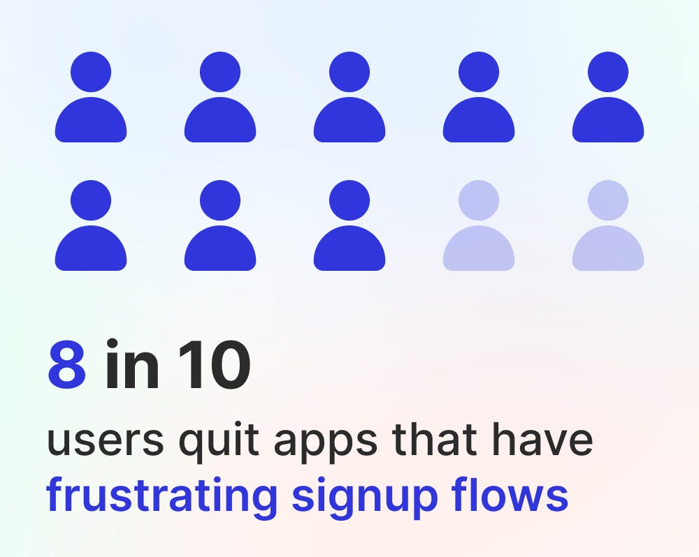
Example: Startups that demand credit card info for a “free trial” or make you confirm through three emails before letting you in. Spoiler: most people will never get that far.
Fix it: Keep it light. Social login options help. Progressive profiling (asking for more details later) is better. If you must gate, do it after the user has experienced value.
7. Ignoring empty states
The empty state is the screen users see when there’s… nothing there. Like the blank canvas of a project management app when you haven’t created a task yet.

Example: You sign into a new app and it’s literally just a blank dashboard. “Cool. Now what?” Then you close it.
Fix it: Empty states are opportunities. Show examples, tips, or dummy data. Guide users to their first action. Think of it as a friendly tour guide instead of leaving people alone in an empty warehouse.
8. Inconsistent design
Your “Save” button is green on one page, blue on another, and buried under a dropdown on a third. Congratulations, you’ve confused everyone.
Example: Early marketplaces that used five different styles of “Buy Now” buttons depending on which developer pushed code that week. Users never knew if they were buying or bookmarking.
Fix it: Consistency builds trust. Create a design system early. Stick to it. (Or, you know, save yourself a headache and grab one from MadeinFigma.com.)
9. Ignoring feedback loops
Users want to know that their actions did something. If they click “Save” and nothing happens, they’ll keep clicking until they either break your app or their mouse.
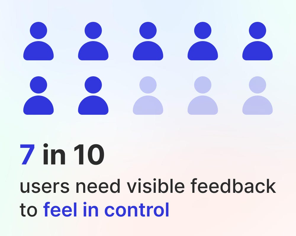
Example: Forms that reload silently with no confirmation. Did it save? Did it crash? Who knows.
Fix it: Add micro-interactions. Show spinners, checkmarks, toasts, confetti, anything that says, “Yes, we heard you.” Even a small animation builds confidence.
10. Forgetting the human touch
Startups sometimes forget they’re designing for humans, not robots. Cold copy, sterile interfaces, and no personality make products forgettable.

Example: Compare Trello’s early playful copy (“Add another card!” with little fun illustrations) to old-school project tools that felt like government tax forms. Guess which one spread like wildfire?
Fix it: Add warmth. Friendly copy, tiny delights, and human touches go a long way. You don’t need to be quirky, just remember users are people, not tasks.
Wrapping it up
Early-stage startups often underestimate UX. But it’s not the polish at the end of the build, it’s the foundation.
Bad onboarding, clunky flows, unreadable buttons, and unfriendly messages will quietly drive users away before you even realize why your retention graph looks like a ski slope.
The good news? These mistakes are fixable. Keep things simple. Guide users. Be consistent. Design with empathy.
And if you want a head start, I built MadeinFigma.com to give founders and designers plug-and-play design systems, flows, and templates that already follow good UX practices. It’s not about reinventing the wheel, it’s about shipping faster without shipping garbage.
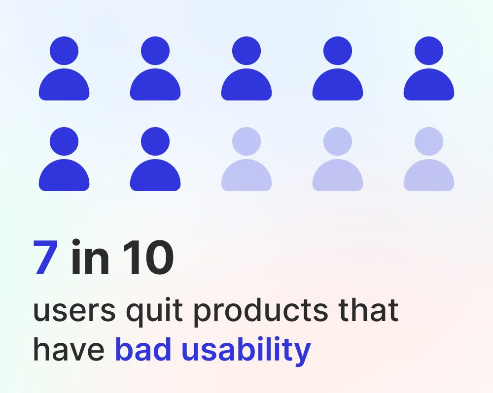
Because at the end of the day, startups don’t fail because of a lack of features. They fail because users don’t enjoy using them. And enjoyment = survival.
Source: Medium